
Book cover design, or, why you should judge a book by its cover
Never judge a book by its cover. It’s the golden rule we’ve all been told over and over again. We’ve heard it repeated all our lives; from parents, teachers, mentors and friends alike. As an idiom asking you not to judge something (and especially someone) by its appearance, it is a fine way to teach compassion, understanding, and the importance of getting to know a person or situation on more than just a surface level. When it comes to actual books though? Maybe we should consider taking the expression less literally. I’m here to tell you why book cover design is so important, and why you should judge a book by its cover.
Book cover design is an important part of the reading experience, and an important tool in marketing your book
Cover artists and designers put a lot of work into creating cover that tells you, at a glance, what type of book you’ve just picked up. A good cover can tell you not only what genre the book is, but what to expect tonally and even hint at what the narrative might be. Obviously it’s not going to give everything away. You won’t find spoilers etched into the front cover image any more than you would in the blurb, and the author’s unique voice still waits to be discovered, but it tells you enough to make you decide whether this is the kind of book for you.
A cover also helps you categorise the book in your mind. A biography will almost always have the person’s face on the cover and children’s books will usually be bright and fun, and sometimes interactive. These may not be judgments about whether you find a cover pleasing to look at, but they are judgements nonetheless, and important ones. If you give a crime novel a cover that looks like a romance, it’s unlikely to reach your target audience.
The proof is in the pudding, but the most delicious looking pudding gets eaten first
Clumsy metaphor aside, of course the actual writing of the book is the deciding factor on whether you leave a good review, recommend it to friends, and generally rave about this amazing, life-changing, brilliant book you’ve just read. No one is saying to only judge a book by its cover, but it’s often that first glimpse of an attractive cover sitting on the shelf that will invite you to pick it up and learn more about the book and its contents. Basically, if you want your book to entice potential readers, it needs to stand out on the shelf.
The Lost Lovelies Foundation
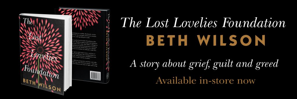
Buy the paperback of The Lost Lovelies Foundation here. Also available on Kindle for $4.99
If you’ve been following Laneway Press, you may be familiar with our book The Lost Lovelies Foundation (and its gorgeous cover) written by Beth Wilson. Beth’s book is a great example of the (exhaustive) process of designing an eye-catching cover that communicates the genre and tone of the book. Here are just six examples of the covers put forward before arriving at the final design above:
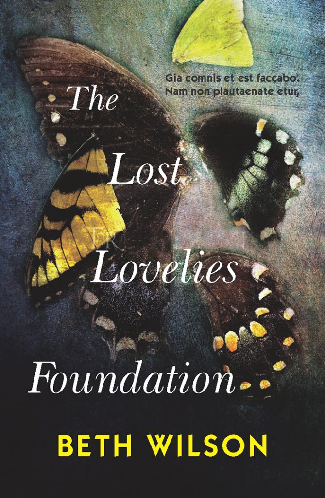


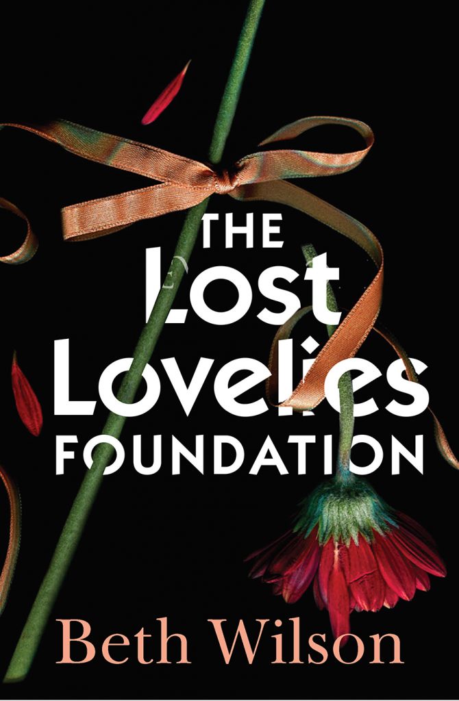

Notice how different font and image combinations evoke different responses? Consider what expectations each book cover design gives you, and which covers you find most aesthetically appealing. What do these covers say about the story? Are you expecting crime? Literary fiction? Memoir? As you can see, the sixth in this series of drafts is very similar to the final product, but the final tweak to have the petals flaring outwards adds an extra touch of drama and symmetry. All of these things have to be considered by the designer, the publisher, and the author when deciding what your book’s cover is going to look like.
Even the most minimalist ‘don’t judge me by my cover’ cover has been carefully designed
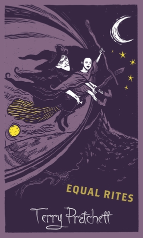
Take Penguin books, for example. The covers we are most familiar with are extremely minimalist, but instantly recognisable orange paperbacks. They are cheaper to produce (and therefore cheaper to buy) and made to be read. They are the opposite of your ‘book as object’ and are popular for that very reason. Even newer collections of these books use the same format, knowing that anyone browsing the shelves will know that these are Penguin books. This kind of book cover design branding is extremely effective, especially when the author or publisher is as well known as Penguin. Other examples include the minimalist re-branding of Haruki Murakami’s books, the Harry Potter series, and Terry Pratchett’s Discworld series.


So, when it comes to book cover design … do judge a book by its cover!
The old adage tells us we shouldn’t, but we do judge our books by their covers, even when we don’t realise we’re doing it. That’s really not a bad thing.
If you love holding a physical copy in your hands, then why not spend your money on a book that is both beautifully written and beautifully designed? Even the cover of a second-hand book can tell you whether it has been well-loved, or if it was thrown away in pristine condition because no one bothered to read it.
If you’re an author, you probably know exactly what it feels like to go back and forth with your publisher and designer trying to find the Perfect Cover for your book. Don’t you deserve to hear that all that effort was worth it?
Keep reading, keep writing, and keep judging books by their covers.
